
Youth Culture Footwear Brand
overview
A footwear brand was launching a new app in the fast casual fashion industry with an emphasis on storytelling, collaborations with creators, and limited quantity product releases catering to the needs of millennials. The app was in need of feature enhancements and added functionality before launch.
This work was done by Ascendum Digital.
CLIENT
Leading global retailer for fast casual fashion
WHEN
Summer/Fall 2019
MY ROLE
Majority of the design work and branding had been completed by another designer, Sergei Belkin. I was put on this project to improve some of the experiences, add functionality, and oversee design reviews with developers before launch. This included user flows, wireframes, high fidelity design mocks, and micro-interactions and transitions.
TOOLS USED
Figma
Principle
Jira

Award-winning product
Ascendum, in collaboration with the client, was able to deliver an award-winning product. It was recognized for a Webby nomination, Hermes Gold award, and an Honorable Mention by the Fast Company magazine.


01–Background
The client is a leader in the sports casual market and wanted to launch an app targeting millennials revolved around creating hype for sneakerheads. This would consist of limited-quantity product releases from collaborations with creators, focusing on the stories behind the creators and products. The goal is to create disruption and bring new products to the market much quicker.
My role was to improve certain parts of the experience, design version 1 of the account creation, and conduct design reviews with developers.
MVP goals


02–Process
Before the app launch, there were a number of improvements and functionality that needed to be explored for the MVP. These included designing the account creation flow, making sure the app passes the proper contrast ratios and typography for accessibility, improving the launch date hype on the product page, and improving size selection.
User Flow
I created this user flow in order to understand the journey from the beginning of launching the app through the purchase process, so I could begin iterating on the rest of the screens.

sketches and wireframes


account creation and sign in
I started by creating user flows to understand the user journey from signing in, creating an account, password recovery, and accessing legal information. I then began laying out the design elements via wireframes, and then explored the visual design.

Wireframes

iterations

accessibility
I had to adjust some of the UI to make it accessible by WCAG standards. This included modifications to color, contrast, and font sizes.


improve launch date hype
The client wanted the launch date on the product page to stand out more and create more “hype” leading up to the drop. During usability tests, some users talked about this section getting lost and not noticing it. They also wanted to explore ways of notifying the user once the product drops. I iterated on different ways to display the drops and notifying the user.

improve size selection
The previous iterations of the size selection consisted of a drop-down that would pop up the native selector to choose a size. The client wanted this to be improved before launch. I did some competitor research and iterated on different ways for users to choose sizes.


03–The Solution
Below are the final screens for the improvements and additions made to the app prior to launch for the MVP. The ability to join or sign in, creating more hype, improvements made to the size selection, and modifications to the design system to make it more accessible.


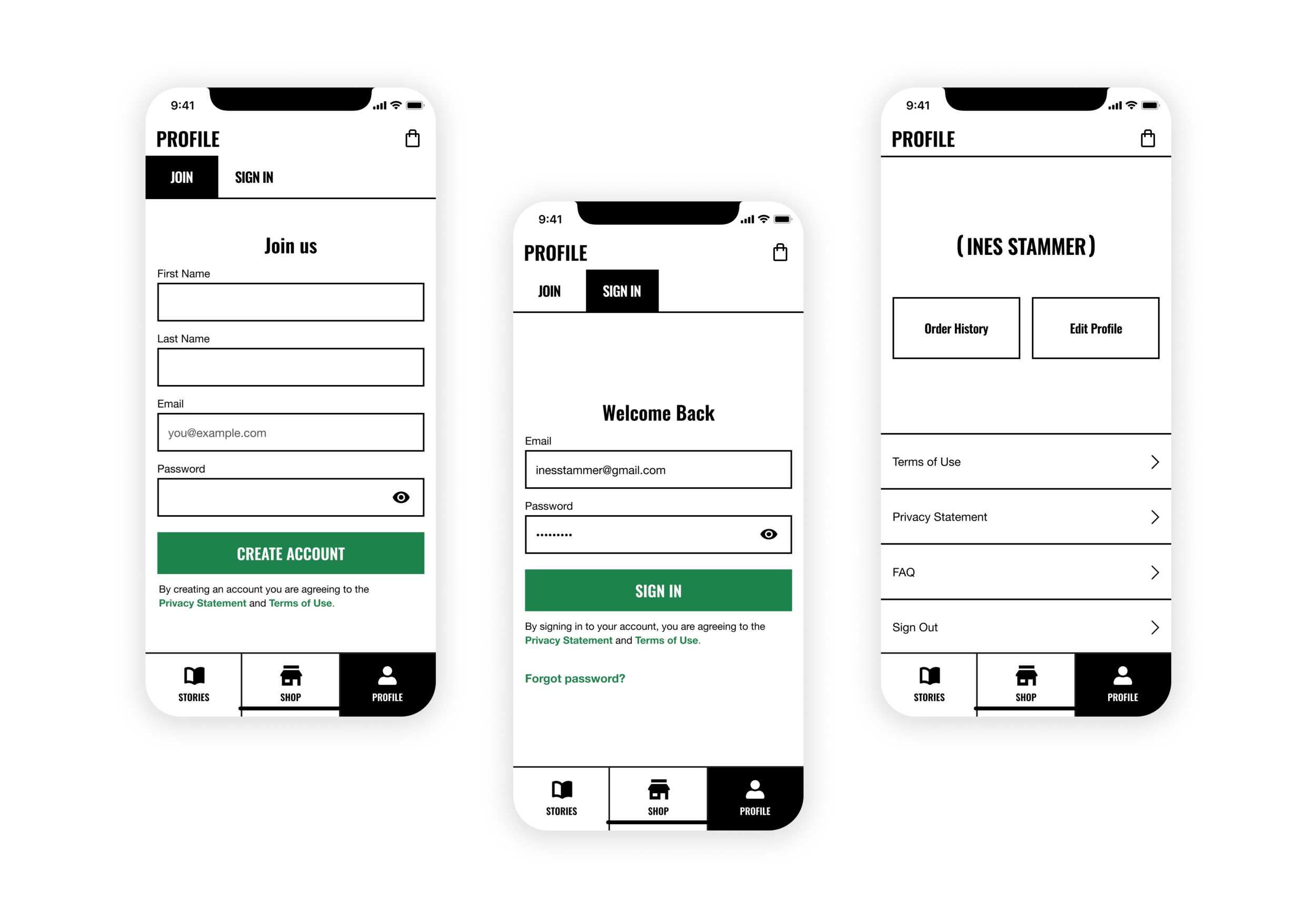
account creation and sign in
The user is able to ‘join’ or ‘sign in’ via the Profile section of the app. It isn’t necessary to have an account in order to access the releases and stories, but in future versions there are plans of storing personal information and customizing the experience for account members.
launch hype improvements
Once a Story’s countdown is over, a “Tap to Reveal” button will appear to read the story and access the product page for the first time.
On the product page, if a product hasn’t dropped yet, there is a modal on the top of the screen that includes when the product will be dropped, with the ability to notify the user when that happens.

product details and size selection
The product detail page includes a carousel of images, the ability to expand and zoom-in on the details, a user-friendly way of choosing a size and adding to bag, and a list of relevant stories below the CTA.


outcome
35% reduction in time for the products to get from idea to launch
Early trend identification
Award-winning design