BestReviews Homepage
overview
BestReviews.com reviews and recommends the best products on the market. As homepage traffic increases, there was a need for a more editorial-style homepage in order to increase repeat visitors and user-engagement.
www.bestreviews.com
*This project was designed in 2019 and may not reflect the current design.
CLIENT
BestReviews
WHEN
Fall 2018 / Winter 2019
MY ROLE
I was the Lead Designer on this project and was in charge of all design and prototyping, and design reviews with developers. I worked alongside our product managers for user-testing and A/B testing.
TOOLS USED
Sketch
Principle
01–Getting Started
The Problem
Users rarely came to the homepage until the acquisition with Tribune Publishing as brand awareness started increasing. The current homepage lacked engagement, trust and credibility, had poor navigation, and left consumers unclear about BestReviews as a whole.
The Opportunity
To attract top-of-the-funnel users who aren’t necessarily ready to make a purchase. We wanted to increase user-engagement and repeat visitors to view BestReviews.com as a destination site.
background
BestReviews.com reviews and recommends the best products on the market, simplifying consumer’s purchasing decisions, saving them time and money. BestReviews was partially acquired by Tribune Publishing, who owns about a dozen media platforms such as the Chicago Tribune and the NY Daily News. With this new partnership, came a lot of advertising opportunities and an increase in brand awareness. The BestReviews homepage didn’t used to receive much traffic, as most of our traffic came straight from Google searches that landed the consumer on a product page. The need for a more editorial, top-of-the-funnel styled homepage was important in order to increase repeat visitors and user-engagement.
02–Research and Findings
We needed to understand what users wanted out of the homepage and what would keep them coming back for more. We wanted to attract more top-of-the-funnel users who weren’t necessarily ready to make a purchase, but instead coming to BestReviews to browse.
Most of our research indicated that users wanted more interesting and engaging content, blog-centric content, and most importantly, wanted to trust our content.
hotjar findings
Users were abandoning quickly
They weren’t scrolling past the fold
They weren’t engaging with our content
Majority of users would use the search bar to go directly to a product page
user research and pain points
Uninteresting content
Users weren’t spending much time on the homepage before navigating elsewhere or abandoning the site. There was nothing there that was keeping them engaged.
Untrustworthy
Users were still confused with who BestReviews is and why they can trust us. There wasn’t enough information about the company and how they come up with the review content.
Poor layout and navigation
Navigating the site and finding relevant reviews to their specific needs was a challenge. Users couldn’t find the reviews they needed very quickly.
the goals
Instead of coming to our site from a google search when they are ready to make a purchase, we want users to come to our site to browse and find engaging content even when they aren’t necessarily looking to buy anything soon. We wanted to attract more of these top-of-the-funnel users, and have them be repeat visitors.
After talking with users and with our new partners about business-goals, we came up with long-term and short-term goals for the homepage re-design. I used these goals to start iterating on possible solutions.
“The long-term goal is for users to view BestReviews.com as a destination site for product reviews.”
Engaging content
Creating content based on the time of year, season, and what is happening in the world will be important for keeping users interested and entertained. Continuously updating our content with new topics and trends, and increasing our video content and social media presence.
Increase trust
One of the main topics of concern for users is the topic of “trust”. Why should they trust our reviews? How are we proving our legitimacy? We will need to provide users with context throughout the homepage with why they can trust us and why our reviews are honest and unbiased.
Ease-of-use
Breaking up content into relevant sections so that it is easy for users to scan and find the content they are most interested in, and making it easier to find the product categories. Increasing the ease-of-use could help prevent abandonment and keep users coming back for more.
brainstorm of features
exploration
03–The Solution
Below is the final design for the homepage. The solution consisted of clearly labeled sections, 2 sections for gaining “trust”, blog-centric content, most popular reviews, a social media section with product “how-to’s” and other interesting videos, and lastly, a bottom section with reviews broken down into categories.
section breakdown
final homepage design
results
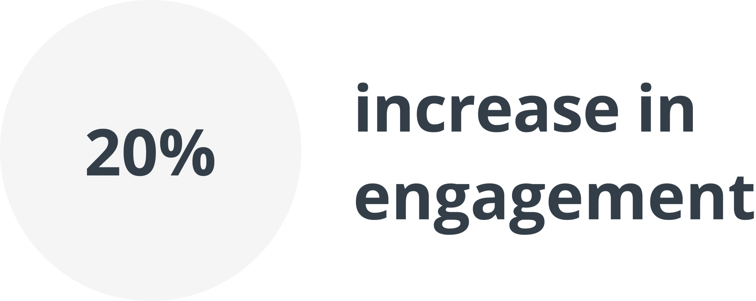
The homepage received an increase in user-engagement by 20% over the next few months. This included longer time spent on the homepage, increased scrolling past the fold, and more consuming of the blog-centric content and social media content. The next steps were to conduct usability tests and do some A/B testing with different content types.


