
BestReviews Wizard
overview
BestReviews.com reviews and recommends the best products on the market. The typical review page consists of the top 5 products in each category, with in-depth product knowledge throughout. However, the 5-product matrix isn’t personalized enough for every product category.
CLIENT
BestReviews
WHEN
Fall 2018 / Winter 2019
MY ROLE
I was the Lead Designer on this project and was in charge of all design and prototyping, and design reviews with developers. I worked alongside our project managers for user-testing and A/B testing.
TOOLS USED
Sketch
Principle


01–Getting Started
The Challenge
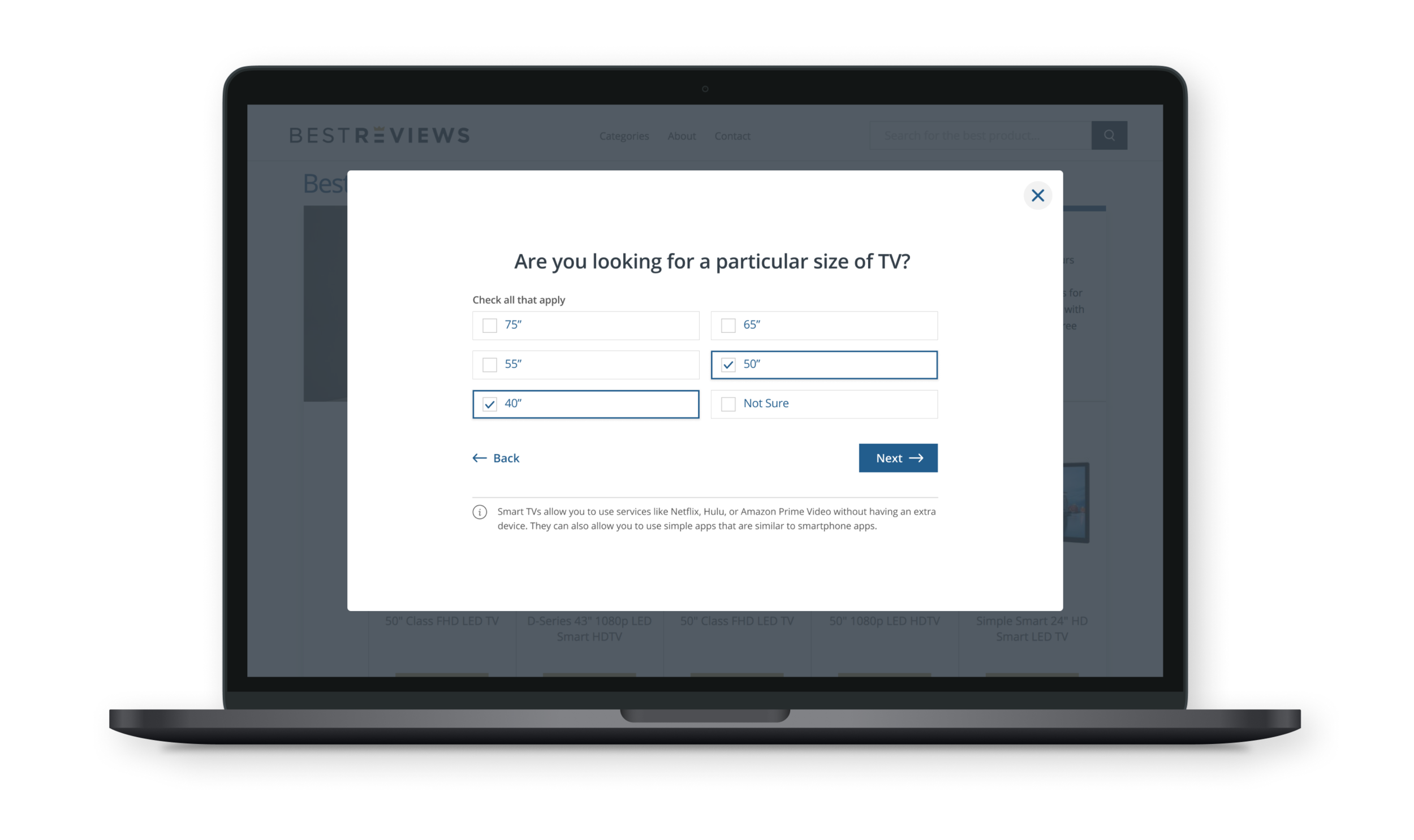
BestReviews simplifies the consumer’s purchasing experience by narrowing down product categories into the top 5 product choices to allow users to quickly compare and contrast. However, not all of our product recommendation pages can apply to all consumers for all situations. For example, if we are recommending 5 TV’s but they don’t come in the size the user is looking for, that entire review page becomes irrelevant to the user.
The Opportunity
To create a more personalized product recommendation experience for the consumer.
current state: product matrix


02–Process
I began by creating user-flows and some wire-framing and exploration around how the user will enter the wizard, how they will answer questions, how they can exit, and how they can get the product recommendations that are right for them.
user flow

exploration


MVP Launch


usability tests
After launching the initial test product and testing on users for several weeks, we conducted usability tests to understand more in-depth about what users liked and disliked about the product. Examples of feedback included: Some users wanted multiple options as a result instead of just being “cornered” into one result, some thought the questionnaire was too long, some thought imagery or illustrations could help, and some thought a level of “trust” needed to be implied for them to believe or understand the result.
Conversion rates varied for different product categories. We were considering anything 3% increase or higher in conversion as a success for that product category, and moved forward with new tests for those categories.

A/B tests for version 2


03–Version 2
When a user lands on one of our relevant pages, the product questionnaire will appear, with the option to opt-out if they aren’t interested. The questionnaire has been designed to handle a variety of different question-scenarios, such as just choosing one answer vs. filling out check boxes to several answers.
Several different design solutions were explored, with the plan of A/B testing the solutions against each other, as well as user-testing the different solutions.


Results
Conversion rates increased between 3%–10% in successful product categories. Anything below that was considered not a success.